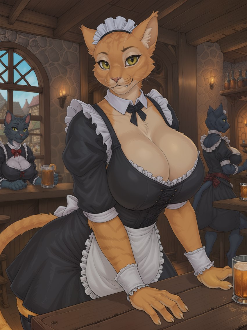
directed by kyxsoon
Viewing sample resized to 22% of original (view original) Loading...
Description

Follow up on the Argonian Maid Cafe with the Khajiit Maid Cafe. Cleaned it up a bit more than usual and I'm excited for Flux based models.

Blacklisted
  • Comments
  • Our prayers have been answered! If this were real life, I know where I'd be going every night after work.

    You did a really good job on this one and the extra time you put in shows (No worries I won't point anything out unless you want me to, as it's always better to focus on what you did right and enjoy such a lovely piece!). I'm looking forward to your future pics and I'm sure others are as well, keep up the good work!

  • Reply
  • |
  • 3
  • darlantan said:
    Our prayers have been answered! If this were real life, I know where I'd be going every night after work.

    You did a really good job on this one and the extra time you put in shows (No worries I won't point anything out unless you want me to, as it's always better to focus on what you did right and enjoy such a lovely piece!). I'm looking forward to your future pics and I'm sure others are as well, keep up the good work!

    Always looking to improve, so let me know ^^. I think in the future, I'll try to generate the background first, and then position the characters inside of it with photobashing and inpainting as I can see a lot of oddities with the furniture.

    Thanks for the kind words and the interest :D

  • Reply
  • |
  • 1
  • kyxsoon said:
    Always looking to improve, so let me know ^^. I think in the future, I'll try to generate the background first, and then position the characters inside of it with photobashing and inpainting as I can see a lot of oddities with the furniture.

    Thanks for the kind words and the interest :D

    Seems like you already know what I was gonna point out since the only issues I saw were about the background and some of the meshing/lines not in the correct spot. Still though, I always ask to make sure as some people do want to become better and appreciate it, while others take offense to it so I'm glad you're the prior but I'll still approach it kindly and respectfully as I love the works you've put out and would love to see more! Only Issues I saw were the door (Partially phased into the roof), The stones by the bottles in the top right meshed a bit funky, the window (bars not lining up/extra bars), and 2 of the stools (circular foot rest/ladder chair).

  • Reply
  • |
  • 0
  • kyxsoon said:
    Always looking to improve, so let me know ^^.

    For me in terms of drawning it's already looks good, nothing to improve. Continue on your own as you decide better. But in terms of scene... I want another scene, but nevermind. By looking my uploads and favorites it's not applicable anyway, so ignore me. Your pictures already looks good anyway.

  • Reply
  • |
  • 3