Description
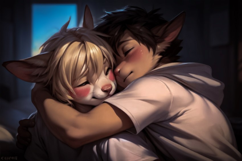
I was a bit surprised the AI managed to get the pose mostly right. The blush on the left character is a bit fierce and the fingers in the darkness aren't the best, but like I said, solid pose for the AI.
Did the usual of trying to punch up the resolution and clarity a bit - ending up desaturating and pushing the piece more towards a darker, moodier setting than the bright piece it was originally.

There are no comments.
Login to respond »